Not So A-door-able
This is the door to the women’s bathroom at Tatte Bakery in Kendall Square.
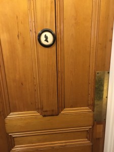
There is a large violation of consistency and standards here; it is difficult to quickly tell whom the bathroom is intended for because the symbol on the door (a woman in an old-fashioned bonnet) is very different looking than the symbol typically used to indicate a women’s bathroom. While one way to fix the problem would be to replace the image with the standard image of a woman used in most bathrooms:

I didn’t want to be inconsistent with the aesthetic of the entire restaurant (which is rustic, old-fashioned, and cozy), so I improved the design by adding the word “women”. It is now easier to quickly scan the bathroom door for the important information, but the original image was not sacrificed.

Additionally, the bathroom actually has another problem — it looks like it is multi-stall bathroom that can’t be locked since there is no indication of whether it is currently in use, but it is actually a single-stall bathroom. A way to fix this additional problem would be to include a sign that switches from “Occupied” to “Vacant” upon being locked.
Here’s an example of good design:

This is a good example of a match between the system and the real world. The lines on the cups in the drawing indicated the amount of each ingredient which is really added to the drink. This menu greatly increases the ease and delight of ordering coffee.