There’s a Light…
Heuristic: Visibility of system status
1.) An item that exemplifies this heuristic is the black dots below applications in the doc of OS X for Macs.
This is a screenshot of the home screen of OS X, a view most people are familiar with. As you can see in the doc below, there are little black dots below certain icons and not below others. This quickly tells the user what is, and is not, currently running. If you open something that is in the doc, a dot below the app appears. If you close that app, the dot disappears. If you choose to open an application that is not in the doc, it appears and also has a dot under it. Upon exiting, the application loses its dot and it disappears. This setup enables the user to see how much stuff they are currently using and it gives an indicator of how stressed the system might be (if your computer starts running really slow and you have 50 dots, that probably means you have too many things running).
http://www.laptopmag.com/images/wp/purch-api/incontent/2015/07/ElCapitanInterfaceLauncher.png
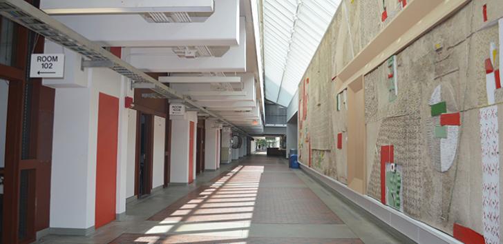
2.) Doors in the Harvard Science Center (and at Harvard + the world in genereal)
Do you ever find that you are looking for a room to study in the afternoon or late at night? Have you ever awkwardly opened the door to find a group of people sitting in a review session that is definitely not the one you are attending? That is a symptom of the poor design of doors at Harvard. While we try to keep the old and historical feel of the buildings, we also keep onto an inability to see which rooms are currently being used. While someone could lock a door to inform someone that the room is currently occupied, that doesn’t really mesh with the culture of Harvard since people are constantly running late or leaving early. And even if it did, is it really optimal to design a door/room that doesn’t let someone know it is occupied until right before they are trying to access it? All in all, I think this does a pretty poor job of showing “visibility of system status” since you really only know that status once you are about to use it.
3.) Improvement:
This takes the simple aesthetic of doors and adds an indicator light at the top of them. Controlled by a switch on the inside of the room (near the lights so it’s simple to turn off as you exit), this turns on or off a red light signifying that the room is occupied. This would be a simple way of notifying people that the room is occupied. While in the illustration I’m using color, you could also illuminate an “X” or some other object to alert those who have colorblindness. This would be a beneficial design change because people would always know whether or not something is being used and people who are using a room would not be interrupted.
http://s7.postimg.org/dbmec76d7/CS179_Image.jpg