Put Some Color on that Canvas!
Design Principle – Redundant Cues
The design principle of redundant cues uses colors or shapes to represent meaning to the user or similar meaning for areas that utilize the same color or shape. An important caveat to using color is that 10% of males are colorblind so relying on color, as the only indicator can be frustrating.
Exemplary Software – Clear
Clear uses colors to indicate a hierarchy of importance. The topmost task is the most important and bright red. As we move down the list in importance the color gradient move towards yellow. When a task is complete you swipe right and the color of the task turns green indicating it was completed. Red clearly indicates something of importance, which the user can recognize from experience with traffic lights, exit signs, stop signs, etc. Yellow is also an indicator of lesser importance as yellow with traffic lights indicates slow down but not stop. Green indicates that something is a “go” and has been finished. This uses redundant cues from daily life to help the user organize tasks by importance.


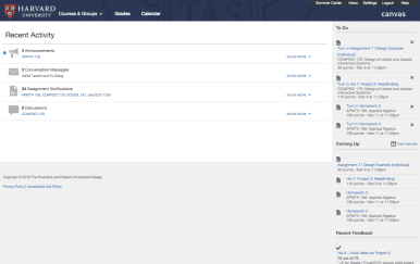
Violating Software – Canvas
Canvas’ software is extremely confusing. The blue dot signals an unread notification and can be an announcement, conversation, assignment or discussion. It is used for every new notification, which gives you no insight into which type of notification it is. Furthermore there is no way to tell which class the notification relates to. On both the main page and the sidebar all the information for the classes you are currently taking is jumbled together. There is no way to quickly tell which notification or assignment goes to which class unless you read the small text, which is frustrating. The use of color and shape redundant cues is a simple way to greatly improve the canvas design.

Redesign
My redesign designates a color and shape for each class and highlights all notifications pertaining to that class with the assigned color and shape. Furthermore I redesigned the page so that there is an announcement, conversation, assignment notification, and discussion section for each class rather than aggregated. I also created an option to redesign the homepage, allowing the users to move around boxes to your liking. This minor change greatly improves the flow of the homepage.
