Famous Apps
Heuristic: Consistency and Standards
There are many websites and apps that share a few general functions like writing a new message, checking notifications, or scrolling through a feed. With such shared functionality across so many apps consistency becomes more and more important.
Good Example: Groupme
The button for sending a new message is extremely intuitive.
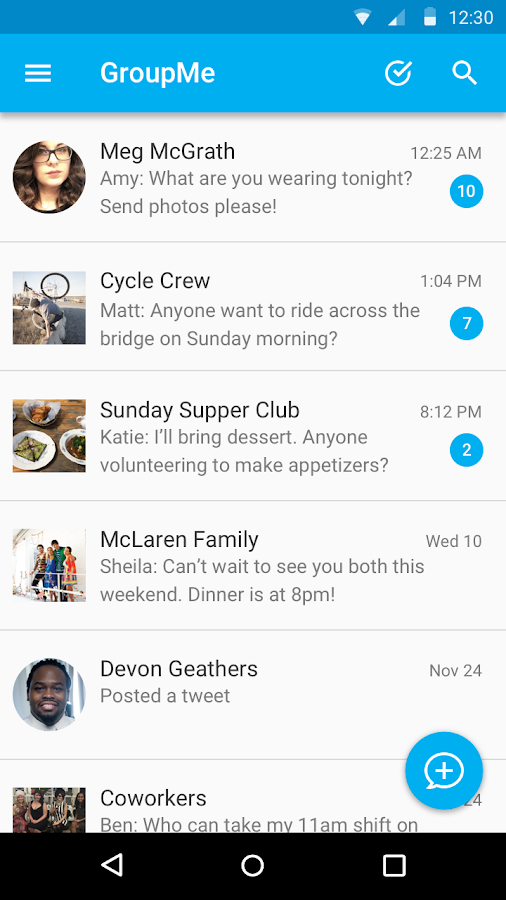
The little blue button on the bottom right not only has a message icon but also a plus icon inside it that reinforces the fact that the user is trying to create a new message.
Bad example: Quora App

Because Quora revolves around posting, answering, and exploring questions it is reasonable to think if you wanted to ask a question that the second icon from the left with a pencil is the button for creating / writing a new post. However, hitting the button actually brings up the following

Which is a list of questions that Quora suggests you answer. I believe that the average user would expect that button to lead to be a way to post new questions.

One way we could fix this problem is to have another button to post a new question such as the little red square with a plus sign inside that I added to the bottom menu. While I would prefer it if the functionality of button to suggest questions was simply not there in general, if we were to keep it then there should be a clear way to post a new question to not cause confusion with that button.